Wrong vs Right Thumbnail Generator
Pick a sample, customize the subject, and generate a fresh YouTube thumbnail in the same visual style.
Choose a style sample
Hover or tap to explore. Select a sample to use it.
Workspace fix
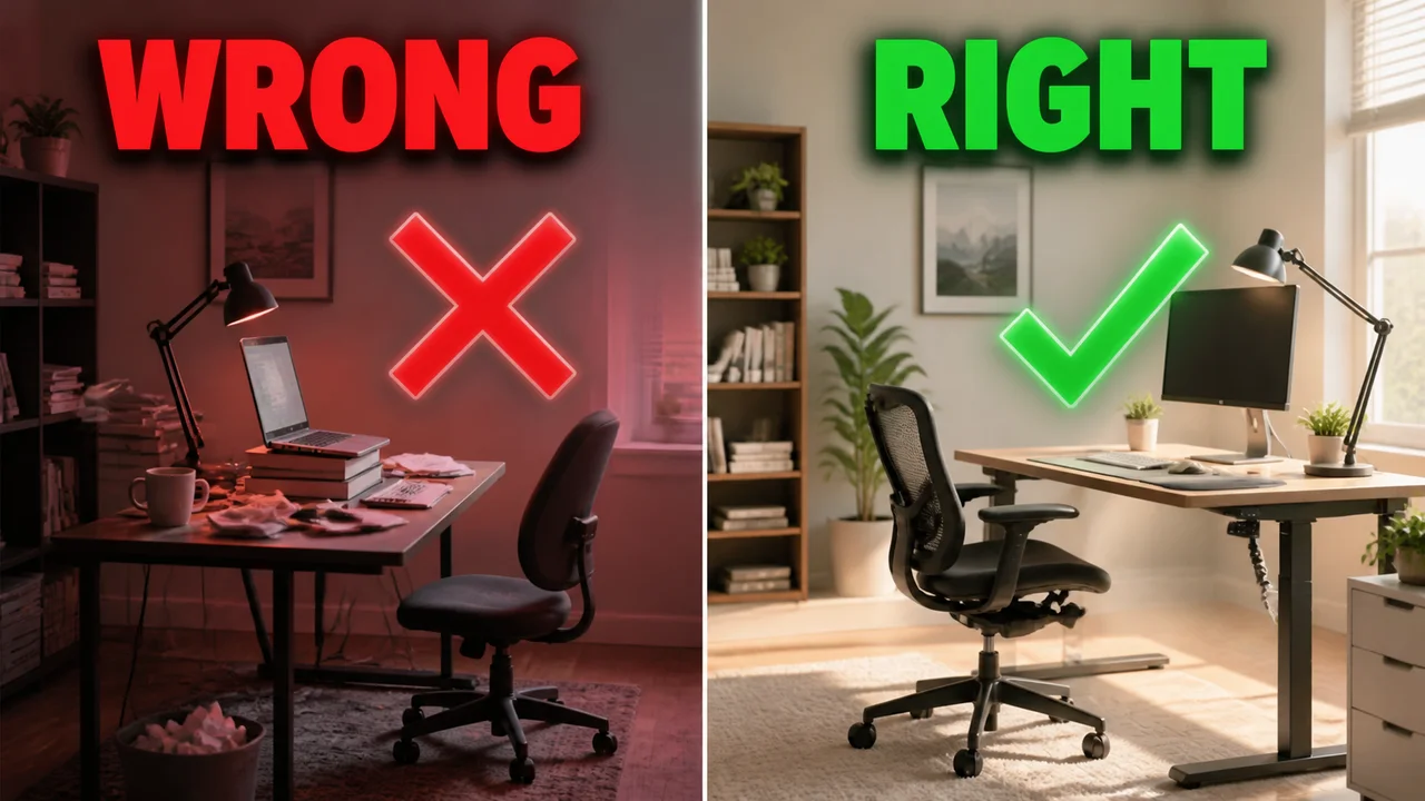
Matched office scenes contrast a cluttered setup with a clear correction.
Customize
Change the story while keeping the selected visual style.
What you get with Wrong vs Right
Wrong-vs-right thumbnails are built for guidance rather than a neutral matchup.
- Matched side-by-side instructional comparison
- Built-in red X and green check visual language
- Works for tutorials, posture, design, repairs, and technique
- Supports uploaded reference subjects
- Outputs at 1280×720 by default
- Generates multiple correction concepts per batch
What makes this style work
Change only one important behavior between the two sides so the lesson is obvious.
Match camera angle, crop, and scale to prevent the comparison from feeling arbitrary.
Use both symbols and color; the X and check remain understandable for color-blind viewers.
Keep labels to WRONG and RIGHT instead of adding a second explanatory headline.
Give each side equal space unless the corrected version needs a close-up detail.
Frequently asked questions
When should I use a wrong-vs-right thumbnail?
How is this different from a VS thumbnail?
Should both sides show the same subject?
Do I need the words WRONG and RIGHT?
Can I use this for software tutorials?
Can the correct option appear on the left?
More AI styles
Browse all
VS Comparison
Generate "X vs Y" comparison thumbnails — the proven format for product reviews, sports matchups, head-to-head benchmarks, and any content built around a direct contrast.

Before / After Split
Generate before-and-after split thumbnails that telegraph transformation in one glance. The proven format for makeovers, tutorials, fitness, restoration, and any content about visible change.

Tutorial Screencast
Tutorial thumbnails with the host face on one side and a screen capture on the other — the format that owns coding, design, software, and how-to YouTube. Familiar layout the algorithm trusts and the viewer can decode in half a second.